Color guide
The right outfit can make a huge difference in how your photos feel and look, especially in Kyoto’s natural and traditional scenery.
I usually recommend choosing outfits that feel comfortable, natural and timeless rather than overly formal or trendy.
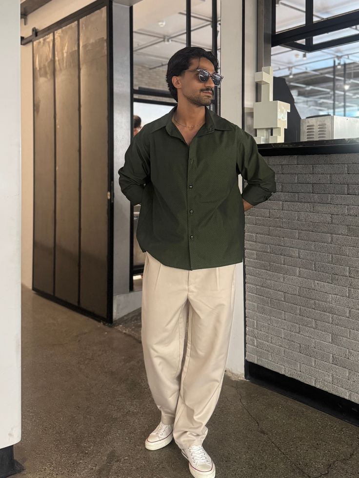
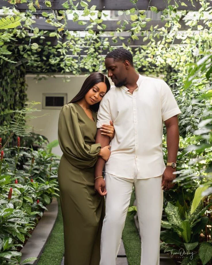
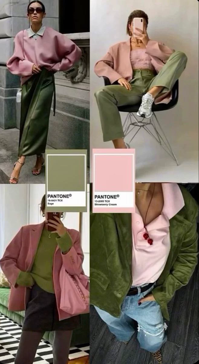
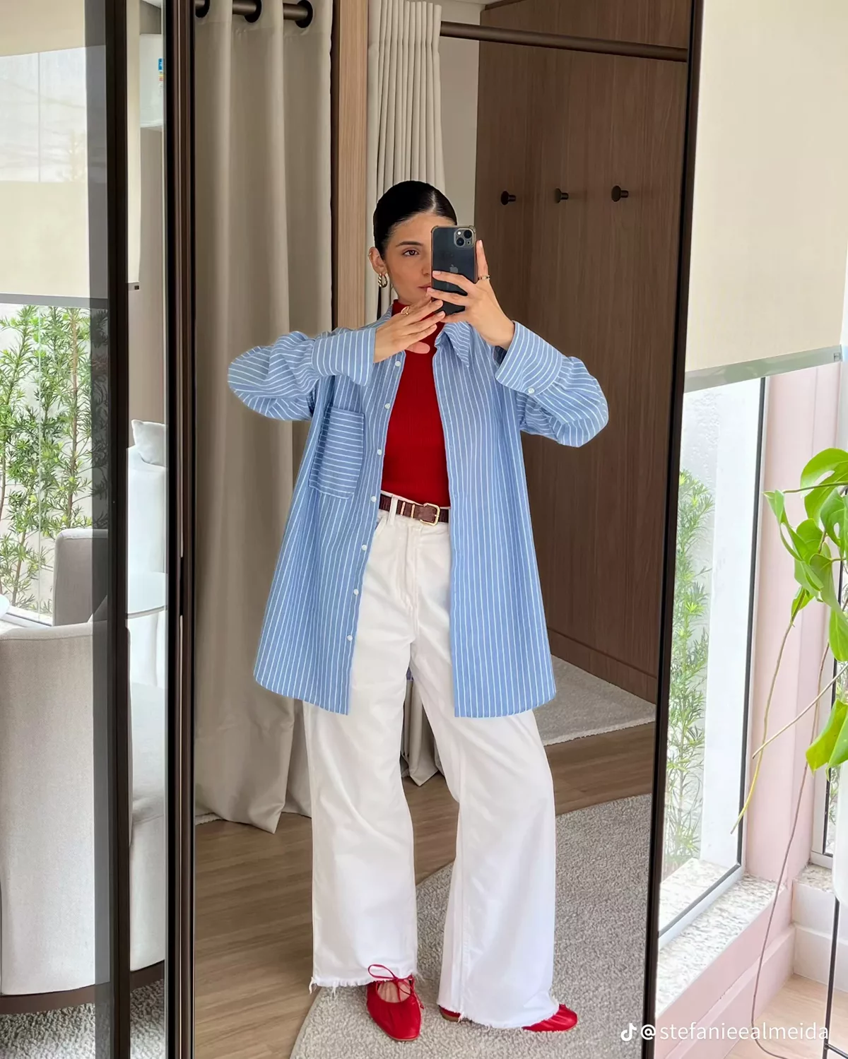
Colors That Usually Photograph Best
Examples:
white/cream
beige
brown
black
navy
olive
muted green
soft blue
soft pastel tones
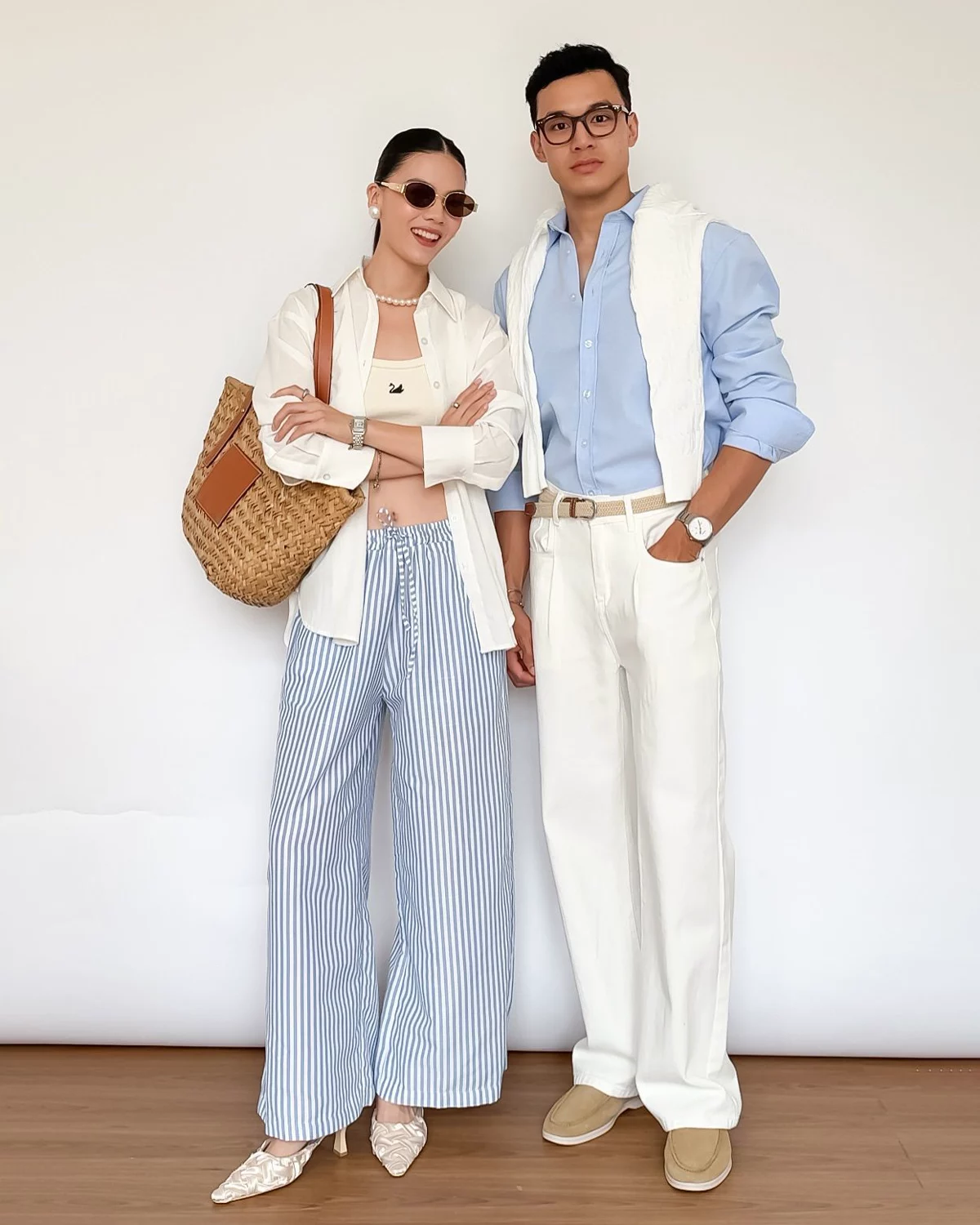


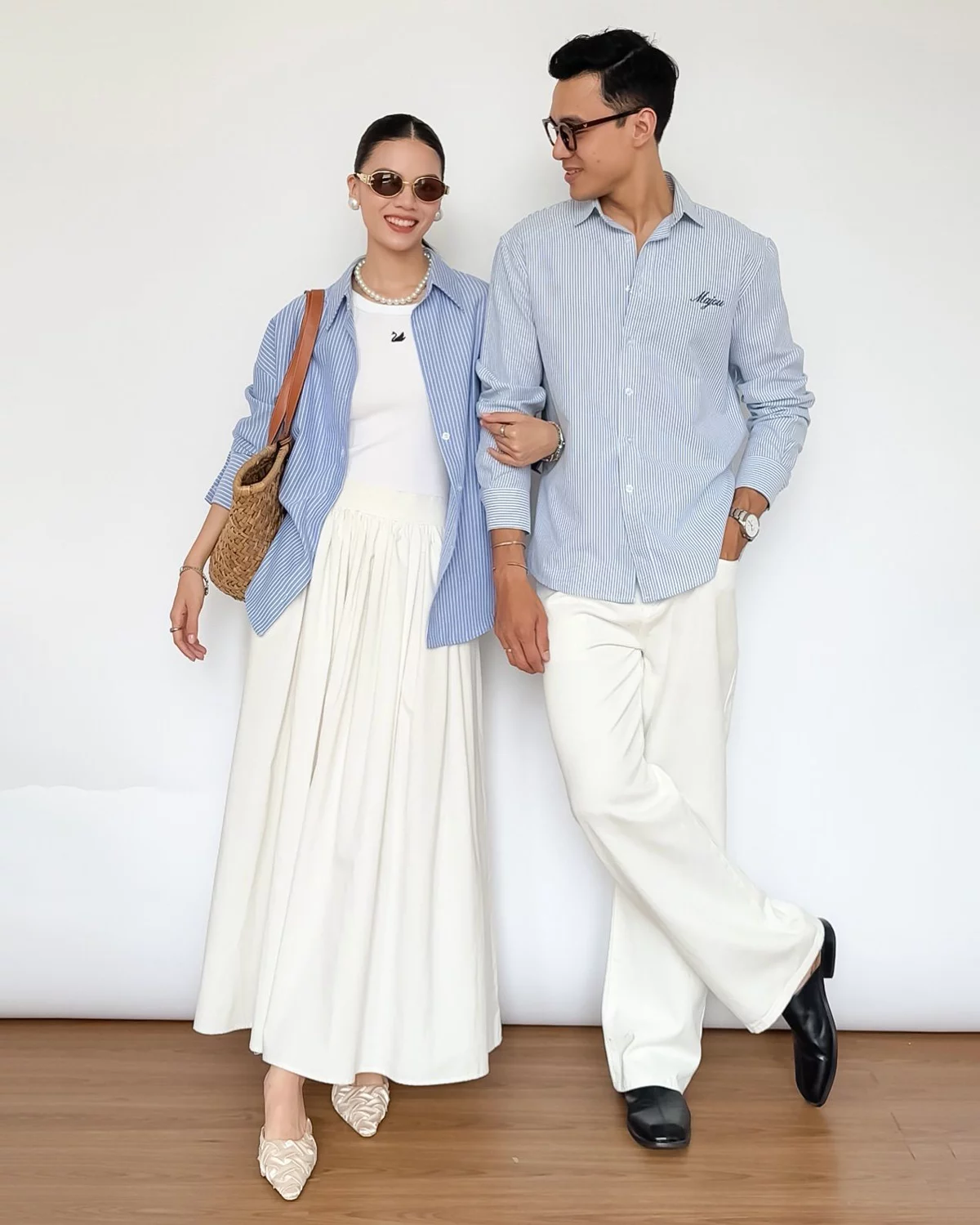
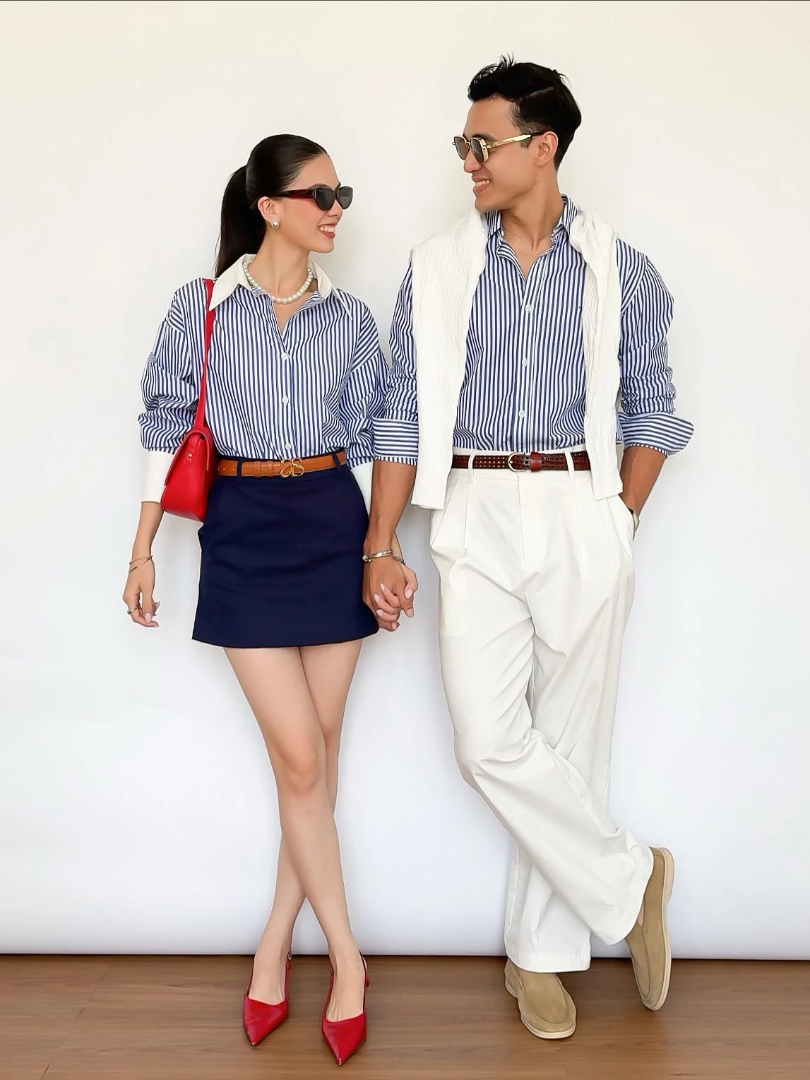

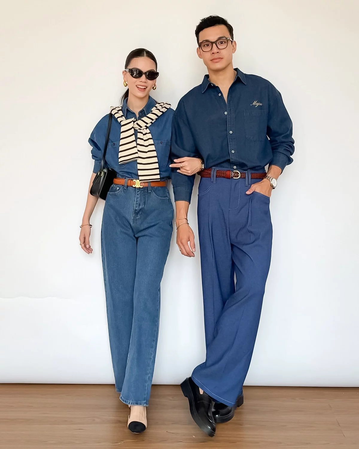






1
Colors & Patterns to Choose Carefully
Very bright neon colors, large logos and extremely busy patterns may become distracting in photos or reflect unwanted color onto the skin during strong daylight.
Bright tones such as vivid pink, turquoise or neon shades can sometimes affect skin tones in direct sunlight.
Bright colors can still work beautifully as small accent details such as shoes, bags, accessories or small outfit elements — especially when combined with softer neutral tones.
The same recommendation also applies to kimono selection. Some rental shops offer kimono in extremely bright or highly saturated colors, but I strongly recommend choosing softer and more balanced tones for photography, especially during daytime sessions.
Please note that if very bright or neon colors are chosen despite these recommendations, color reflection on the skin and overall color cast in the photos may occur, and this is not considered a photography or editing issue.
Examples of colors I recommend avoiding:
2
Outfit Tips
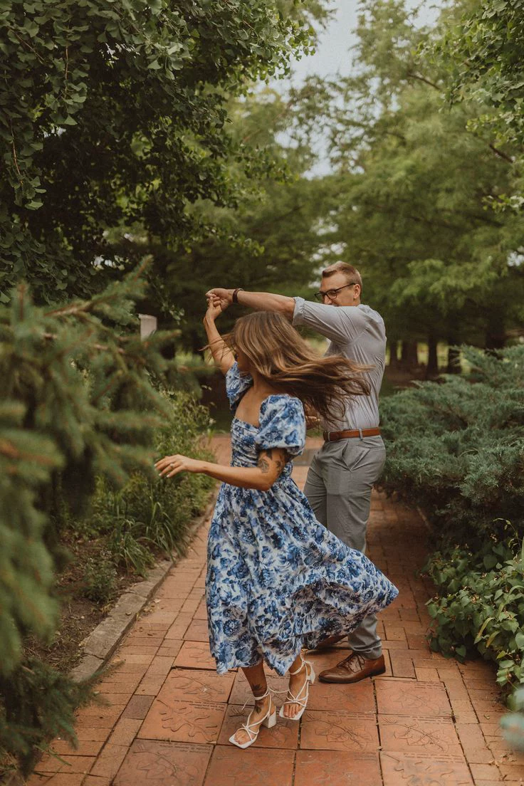
Flowy fabrics, layers and textured materials often photograph beautifully in motion.
Comfortable shoes are highly recommended, especially for sessions with a lot of walking.
Outfits do not need to perfectly match, but photos usually look more harmonious when colors, textures, or overall tones complement each other naturally.
Small details such as similar fabrics, repeated accent colors, or coordinated layers can help create a more cohesive and cinematic atmosphere in photos.


3
Outfits for Fushimi Inari
For locations such as Fushimi Inari or other shrines with bright red/orange torii gates and temple elements.
The strong red/orange surroundings reflect warm light onto both skin and clothing. Because of this, pure white or very light outfits can easily pick up an orange/red color cast in photos, especially when shooting close to the torii gates or inside shrine pathways.
For the most balanced and natural-looking results, I usually recommend:
– Beige or cream
– Olive green or muted green
– Black or dark grey
– Soft brown or earthy tones
These colors work beautifully with the location and help avoid strong color reflections on the skin and fabric.
White outfits can still work, but please keep in mind that warm reflections will be much more visible in these environments.
4
Seasonal Notes
Light and breathable fabrics are strongly recommended because Kyoto can become very hot and humid during the day.
Layered outfits, coats, scarves and textured fabrics work especially well during colder seasons in Kyoto.